Originally published in April 2022 under BM Design, Brittani's former studio. Revisited and updated for Translated.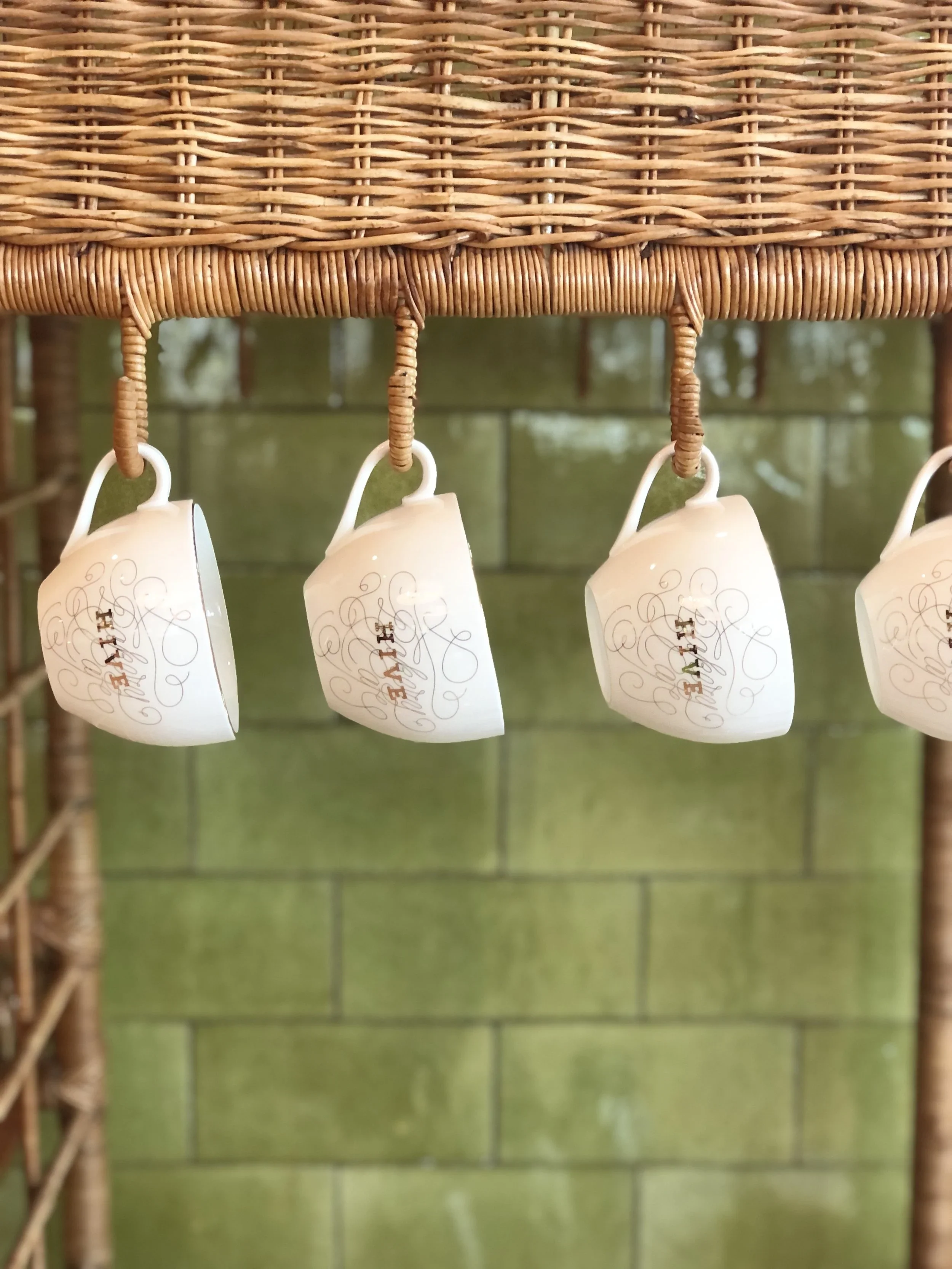
There are brands you experience before you ever look them up. You walk toward the entrance and something just clicks. The greeting, the light, the way the pastries are arranged in the case. You feel it before you can name it.
That is the test I am always running. Does the brand create a feeling before you have to think about it?
Hive Bakery & Cafe passed.
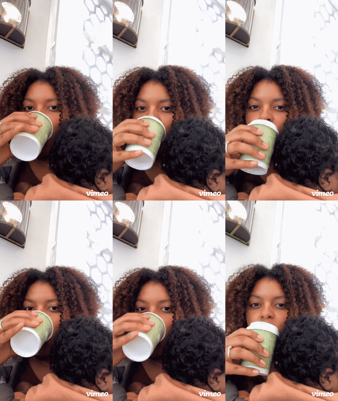
I visited the West Palm Beach location with my daughter after following the brand for a while.
They had been building toward this café concept before the pandemic hit, and watching it finally open was a full-circle moment.
I had been paying attention to this brand for a reason. I wanted to see if what they built in person matched what they had been putting out into the world.
It did.
The Arrival Experience
Walking up, the tone was already set. The greeter at the door was warm without being performative. The pastry display stopped me in my tracks. I wanted everything in the case, even the things I could not identify. That is not an accident. That is a considered brand decision about how much the environment should do before a word is spoken.
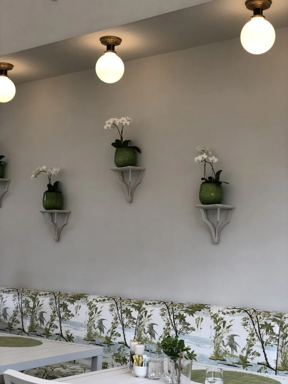
It felt like a café in Paris. And I do not say that as a cliché. I say it because transportation is the whole game in experience branding. You are not just selling pastries. You are selling the feeling of being somewhere else, somewhere elevated, somewhere that slows you down. The chocolate croissant and cinnamon roll confirmed it. That cinnamon roll was flaky, airy, and soft in a way that still lives in my memory.
The space did not have to work hard to convince me of anything. I was already in it.
The Brand Work
Here is where it gets interesting.
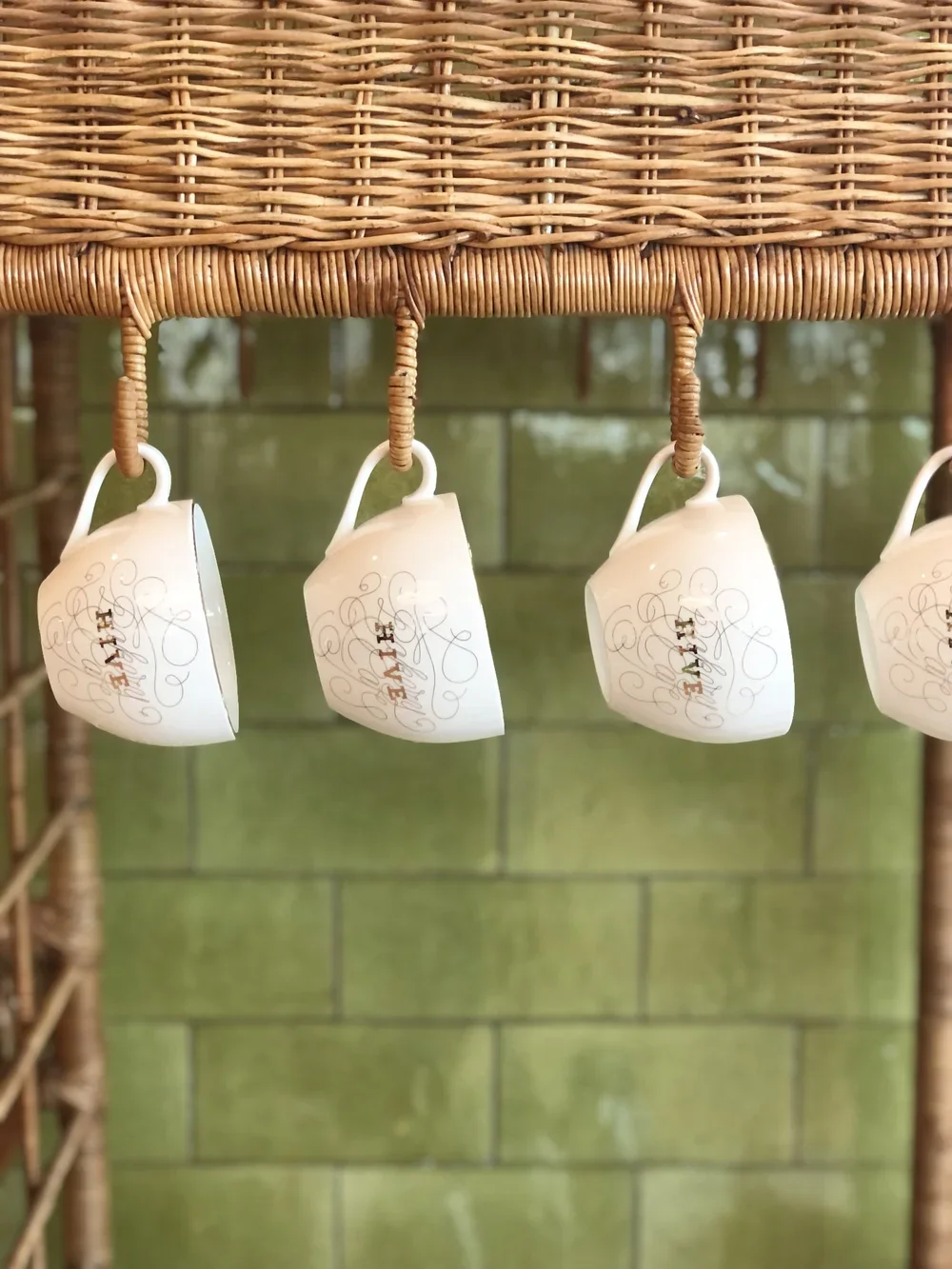
The color system was intentional throughout. The greens and golds you associate with the Hive identity were everywhere: the greenery inside and outside, the packaging, the coffee cups, the plates. But it never felt overdone. The brand did not fight for attention inside its own space. It just kept showing up, quietly and consistently.
That is harder to do than people realize. A lot of hospitality brands overload their identity on the visible surfaces and forget about the moments in between. Hive did not. They used the full system.
Even their to-go packaging was considered. One of the prettiest branded bags I have seen. That matters because the experience does not end when the guest walks out the door. The bag on someone's arm in downtown WPB is still the brand doing its job.
Typography as Brand Consistency
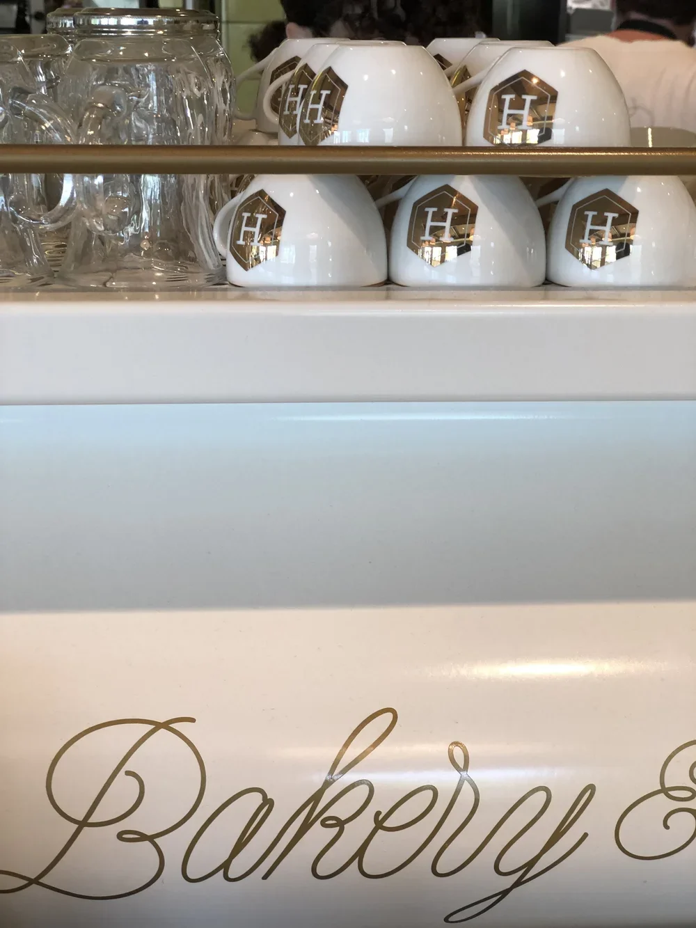
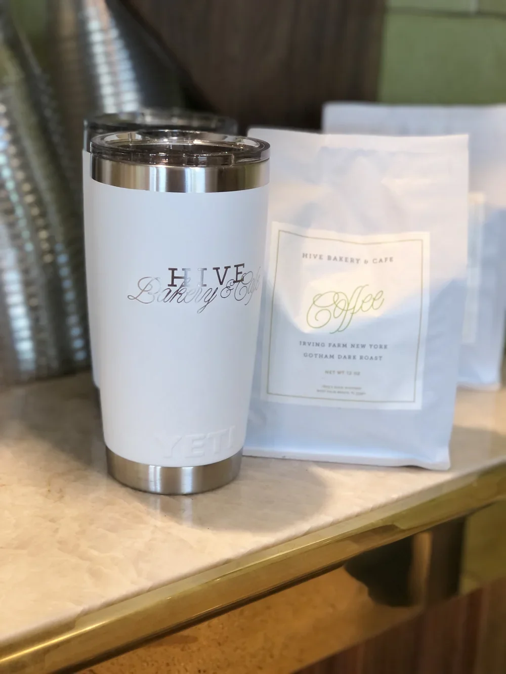
The typeface system was clean and disciplined. Two fonts, used well, used everywhere. On the signage, on the packaging, on the retail coffee bags and tumblers available for purchase. The repetition built recognition without feeling repetitive. That is the distinction.
A lot of brands think they need variety to keep things interesting. What they actually need is a system with enough flexibility built in that the brand feels fresh across applications while staying unmistakably itself. Hive did this with logomark variations used across different surfaces. The alternate versions did not compete with each other. They created a pattern language. You knew you were looking at Hive even when the primary mark was not front and center.
The Takeaway
Your brand identity system is not just a logo and a color palette. It is a set of tools that, used with intention, builds recognition and emotional resonance across every single touchpoint a guest encounters. From the digital search that brings them to you, to the bag they carry home.
Hive understood that. And you feel it when you are inside. You feel it when you leave.
That is the work.
Does It Translate? is a recurring series on Translated where Brittani Millington applies a brand strategy lens to real hospitality and experience brands to test whether the feeling a brand creates online actually shows up in person.